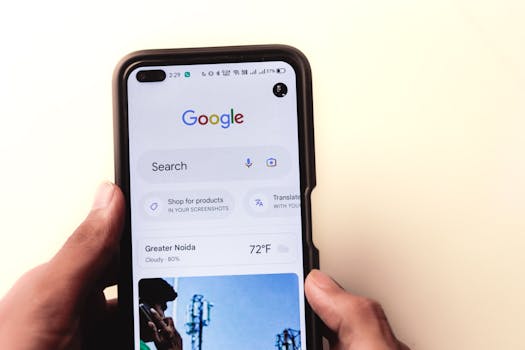
Mobile internet usage has skyrocketed over the past decade, fundamentally changing how people access and interact with websites. In fact, as of 2024, over 58% of global website traffic comes from mobile devices, according to Statista. Google has also responded to this trend with mobile-first indexing, making the mobile version of your website the primary source for ranking and indexing content. If your site isn’t optimized for mobile, you risk missing out on search visibility, traffic, and conversions. But optimizing for mobile SEO goes far beyond simple responsive design. It requires a thoughtful approach to speed, usability, structure, and search intent. In this article, we’ll explore actionable strategies to help you optimize the mobile version of your website for superior SEO results.
The Growing Importance of Mobile SEO in 2024
Mobile SEO is no longer optional—it’s essential. With more than half of all web traffic coming from smartphones and tablets, Google’s algorithms now prioritize mobile-friendly sites in their rankings. In November 2023, Google completed its switch to mobile-first indexing, meaning that Google predominantly uses the mobile version of a website for ranking and indexing.
This shift has significant implications:
- Pages that aren’t mobile-optimized risk being under-ranked, even if their desktop versions are flawless. - User expectations for mobile speed and usability are higher than ever. According to Google, 53% of mobile site visits are abandoned if a page takes longer than 3 seconds to load. - Conversion rates drop by up to 20% for every additional second a mobile page takes to load.Ignoring mobile optimization means missing out on search rankings, traffic, and revenue. But what does “mobile optimization” really mean in 2024, and how can you go beyond the basics for better SEO results?
Mobile-First Design: Beyond Simple Responsiveness
While responsive design is a fundamental step, mobile-first design takes it further. Rather than adapting desktop layouts to fit smaller screens, mobile-first design starts with the mobile user experience and scales up for larger devices.
Key principles of mobile-first design for SEO include:
- Prioritize content hierarchy: Place the most important information and calls-to-action at the top of the mobile viewport. - Minimize clutter: Remove unnecessary elements that slow down loading or distract users. - Use touch-friendly navigation: Ensure buttons, menus, and links are large enough to be tapped easily. Google recommends a minimum target size of 48x48 pixels. - Optimize font size and spacing: Text should be legible without zooming, ideally at least 16px in size.A mobile-first approach ensures that your site not only looks good but also functions seamlessly for on-the-go users—a crucial ranking factor in mobile search.
Page Speed: The Critical Edge for Mobile SEO
Speed is a decisive factor for mobile SEO. Google’s research indicates that the probability of a user bouncing increases by 32% as page load time goes from 1 to 3 seconds. For e-commerce sites, a one-second delay can lead to a 7% reduction in conversions.
To optimize mobile page speed:
- Compress images and use next-gen formats like WebP. - Minimize JavaScript and CSS, and defer scripts that aren’t essential for above-the-fold content. - Use browser caching and Content Delivery Networks (CDNs) to reduce latency. - Enable lazy loading for images and videos.Below is a comparison of common performance metrics between well and poorly optimized mobile sites:
| Performance Metric | Optimized Mobile Site | Poorly Optimized Mobile Site |
|---|---|---|
| First Contentful Paint | 1.2 seconds | 4.5 seconds |
| Largest Contentful Paint | 2.0 seconds | 6.0 seconds |
| Time to Interactive | 2.3 seconds | 7.1 seconds |
| Mobile Bounce Rate | 35% | 62% |
Regularly test your mobile site speed using tools like Google PageSpeed Insights or Lighthouse, and address any bottlenecks immediately.
Structured Data and Mobile Search Features
Mobile search results often feature rich snippets, carousels, and quick answers, all driven by structured data (Schema.org markup). Implementing structured data improves how your content appears in mobile SERPs and can increase your click-through rates by up to 30%.
Best practices for structured data on mobile:
- Use JSON-LD format, which is recommended by Google for mobile and desktop. - Mark up key elements such as articles, products, reviews, and FAQs. - Ensure that structured data is present and identical on both mobile and desktop versions to avoid indexing discrepancies.Structured data also powers features like voice search and Google Discover, both of which are heavily used on mobile devices. In 2023, 27% of the global online population used voice search on mobile, making optimization for these features more important than ever.